Like them both.
Good to see the new board sticking with the club’s identity.
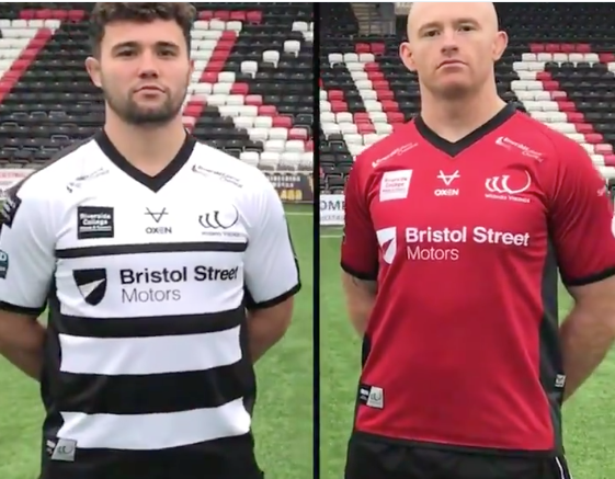
not impressed as usual but sometimes the designs grow on you after a while but these are pretty basic looking. as long as it brings money into the club i suppose. cant see the red one being a big seller
looking again i think the white one might grow on me, the top half is quite classic widnes looking, i think the white one would look better plain and then the could of played around with the red one a bit
Not all that fussed about shirts myself but that looks alright to me,both.
Both are decent to be honest, we have had some absolute mingers over the last few years!
Like the white one, classic Widnes kit with a decent amount of black at the bottom.
I like the home shirt the best.
I like the home. Not that fussed on the red. Both simple will hopefully sell well

Classy home shirt, away is a bit 'Salfordy' to me.
They'll sell well, I'd imagine. Capey will be all-in for that home shirt!
Paulie xx
They both look pretty good to me, but it is all personal preference. I quite liked the dull gold shirt we had a few years ago, but I know it was not that we'll liked by some.
The home shirt in particular looks good.
Classy home shirt, away is a bit ‘Salfordy’ to me. They’ll sell well, I’d imagine. Capey will be all-in for that home shirt! Paulie xx
😂
like the home kit quite good 8/10, away kit is just OK 6/10
looking again i think the white one might grow on me, the top half is quite classic widnes looking, i think the white one would look better plain and then the could of played around with the red one a bit
I agree, at first glance wasnt impressed, both look a bit basic. As most have said however, I think the white looks the better shirt and could grow on people.
Not bought a shirt for past few years, but will probably get one this year basically just to help the club more than anything.
I thought that we are meant to be getting a third shirt with the names of those who donated their season ticket money imprinted onto it, think I will hang on and see what that one is like as not enamored with either of these two.