Positives: A return to a mainly white shirt with black on the sleeves and black shorts. Return of a version of the club crest.
Negatives: Got the motto wrong. Also, feels a bit amateurish again with the way it is presented and launched.
Thoughts?
Football top.
Amateurish.
The launch is embarrassing. Who exactly is doing the media and what’s their qualifications for the role? No video, no graphic. Can’t believe anybody thinks a photo of the kit on a wooden floor is a good way to present them.
Another sad reflection of how the club is run. Sad times
I can't criticise too much because I've pushed for a return to the town crest for years,But sadly it's been executed poorly.. No blue in the crest and nothing underneath it,The away shirt is probably the best of the two.
Looks like an item on sale on the vinted app..
Did anybody go down too the ground to view them? Surely they kits were not presented as seen on the photos….SURELY!!
On the press release, it says they will be available from the Widnes shop from 10-30, but doesn’t say which day. Is it just normal days, or are they opening extra days to help people buy them before Christmas?
The shop is opening on Monday for the next two weeks.
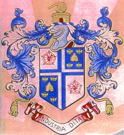
To (hopefully) settle the Town Motto argument see the following:-
| WIDNES BOROUGH COUNCIL |
|
ARMS: Quarterly Argent and Azure a Cross per cross quarterly counterchanged in the first and fourth quarters a Rose Gules barbed and seeded proper and in the second and third a Beehive between four Bees volant saltirewise Or. Motto 'INDUSTRIA DITAT' - Industry enriches. |
 |
|
The red roses refer to the Lancashire County connection and the bees are emblems of industry. |
Pathetic that the town motto is incorrectly spelled. To call it a schoolboy error is an insult to schoolboys everywhere. OTOH maybe they'll become collectors items once it is fixed. Probably not.
I think the away jersey is modern and a good design. The home jersey colors are a nod to the old days and I like that with the old badge aswell. The spelling mistake… ok that’s amateurish to put it bluntly but it will be remedied surely. We have to remind ourselves that we are a PT club but we can do better when it comes to maybe a short video of a player walking onto the pitch or something? I’d like to thank the sponsors and I look forward to the season ahead.
I hope the home kit will have black shorts and white socks
Do you really think people wil buy any no chance I will purchase unless they are rectified.On the press release, it says they will be available from the Widnes shop from 10-30, but doesn’t say which day. Is it just normal days, or are they opening extra days to help people buy them before Christmas?
The picture attached is a simple example of how our new kits could have been launched on one of our players which would have been more professional IMO. I know our Eric and John Bassnett were at the stadium helping launch the new kit which is a great idea from the club

I don't like how the sponsor of this club is a debt collector. They are hurting a lot of people in this town who are struggling to pay their bills. The club should care more about the community and not just the money. The typo on their logo is bad, but the sponsor is worse! We also have a PDRL team, working in the charity sector. Debt collectors are ravaging this community!
Its just a company doing their work they don,t force the issue the courts and the law do that for them.I don't like how the sponsor of this club is a debt collector. They are hurting a lot of people in this town who are struggling to pay their bills. The club should care more about the community and not just the money. The typo on their logo is bad, but the sponsor is worse! We also have a PDRL team, working in the charity sector. Debt collectors are ravaging this community!

Its just a company doing their work they don,t force the issue the courts and the law do that for them.I don't like how the sponsor of this club is a debt collector. They are hurting a lot of people in this town who are struggling to pay their bills. The club should care more about the community and not just the money. The typo on their logo is bad, but the sponsor is worse! We also have a PDRL team, working in the charity sector. Debt collectors are ravaging this community!
It's like Folk who slag off the Police, but who is the first people they ring if they are burgled or wronged in other ways?
Yep, the Police.
Paulie xx