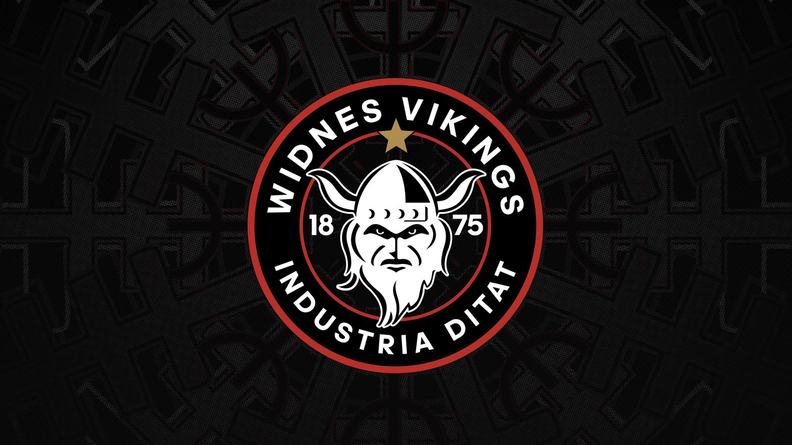
Widnes chairman Stuart Murphy confirmed giving the club identity was a key reason behind rebranding the club
He went onto say “If I showed a child the new logo they would instantly reply “Vikings.” “The existing crest doesn’t signify who we are.”
The new logo also includes a star to represent Widnes’s greatest ever triumph, winning the World Club Challenge. Industria Ditat is also included on the Crest to dedicate respect to the towns proud industrial industry.
Two red rings are included on the logo to represent the blood line of Widnes that is never ending and this years club moto “It is in our DNA.” The rings also represent the clubs European and World Club Challenge honours.
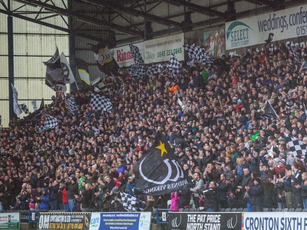
It will be the first time since 2008 Widnes will walk out onto the field with a new club crest in 2026 marking an end to the last memory of the Ste O’Connor era.
Have your say
The Widnes Rugby Chat Podcast would like to know where the new crest ranks compared to logos of the past? Cast your vote below and results will be revealed on the next episode.