When the club released a new range of merchandise featuring three different club logos, it prompted a discussion as to whether the old Vikings head logo should be brought back.
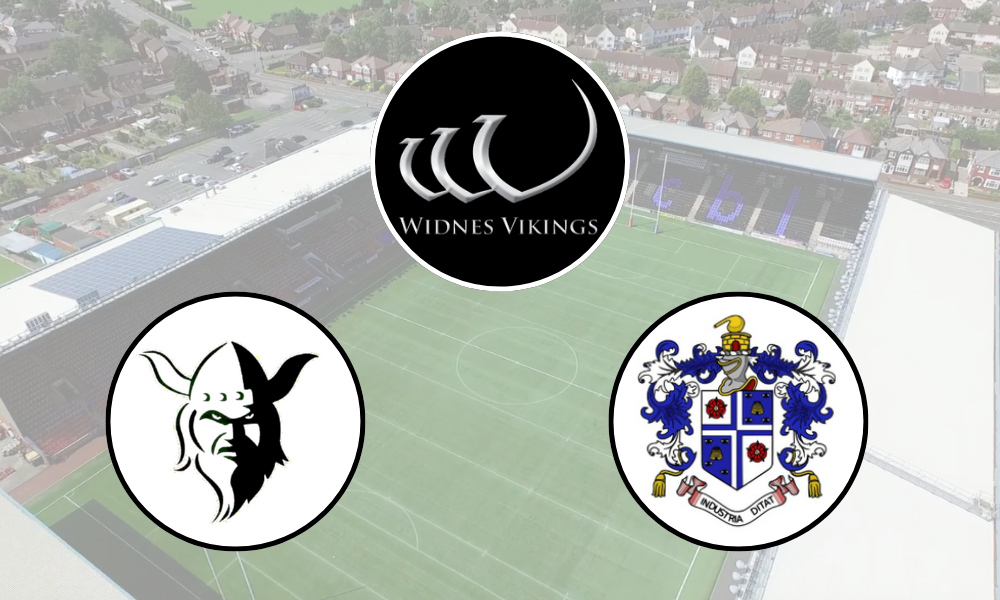
The current ‘Viking longboat’ logo was introduced at the beginning of the Steve O’Connor regime back in 2008, signifying a new era after the administration the previous year.
At the time, it was deemed a ‘dynamic new look’ for the club in keeping with ‘the demands of the 21st century’ with the idea that it would become recognisable in its own right.
It soon had to be paired with ‘Widnes Vikings’ text underneath, and with the advent and evolution of social media, the demands of a club logo and branding have changed.
If anything, the old Viking head is more suitable to current trends. Ultimately, clubs want logos they can display in a square format and on many different backgrounds.
The Viking longboat logo is an odd shape, doesn’t really identify the club too well without the awkward text underneath, and it only really works on a black or white background.
The two previous logos were of course the old town crest and then the Viking head, that was first introduced in 1996 when rugby league clubs started to adopt symbolic monikers.
☀️ If you’re getting ready for your summer holidays…..
⁉️ Why not get one of our Vikings beach towels?
🙌 Now available at the Stadium shop and online 👉 https://t.co/pzp9o7EgZt#VikingsForevermore pic.twitter.com/ble8l82MZe
— Widnes Vikings (@WidnesRL) June 3, 2025
So is it time to change?
Many rugby league clubs have re-branded their logos in recent years. For some, like St Helens and Hull KR, it has been a case of successfully modernising and upgrading their logo as part of a wider brand refresh. For others, like Warrington and very recently Bradford, the jury is out on whether the change was necessary. Castleford, London and Toulouse have all refreshed their logos in recent weeks.
Changing the logo has a big impact. It’s not just the badge on the club shirt, it’s on signs in the stadium, any signs out and about, on all of its digital inventory, merchandise from over the years that people own and wear – and don’t forget fans with tattoos!
It isn’t a case of changing the logo and everything works. Hull KR are a fine example of how a change to their club logo has triggered a significant upgrade in all of its branding and marketing activity – using facets of the logo in-stadium, for merchandising and identity.
What could a new Widnes Vikings logo look like?
Some still hanker for a change to the old town crest. Put simply, in the modern age, this just won’t work. The club can celebrate its heritage in other ways, as it has done quite successfully in recent years.
The 2025 kit was a throwback to the club’s foundation, and the town crest appeared on all kits and merchandise.
However, for the past two seasons, the actual club logo hasn’t appeared on the home shirt. That’s just no good when it comes to building identity for Widnes Vikings and potential new fans.
At the same time, you don’t want to add a completely new logo in to the mix that dilutes the brand even more.
Now I’m not a designer, but had a very quick go at pulling together a modernised version of the Viking head.
![]()
It uses the old Vikings head, so keeps familiarity with previous branding. You could maybe add the star for the World Club Challenge win, or add RLFC somewhere in. But it’s an idea.
I shared the logo above on Twitter and on the Widnes Rugby League Fans Facebook page. Here’s what people had to say.
What have fans said about possibly changing logo?
@reid_r11: Much prefer the Viking than the 3 lines, think it’s a bit more marketable and it’s clear what it is. Think a star for the WCC would be a nice touch too
@dennkelly: Never understood or liked the 3 lines nobody has a clue what it’s supposed to represent, in my opinion of course.
John Sheridan: 1. Wearing the town crest 6 times on our kit for the first 100 years and then intermittently since then doesn’t make it “traditional”. Unsure why fans think it is. I understand it may be something that gives fans a close affinity to the town but town crests aren’t marketable to the younger generation in any way.
2. If fans can’t see the viking boat in the present logo then they’d have really struggled with those magic eye pictures some years ago!!I MHO it’s innovative, clever and modern but it still doesn’t scream “Vikings”.
3. The original viking logo is probably the best one for marketing purposes and I’d be happy to go back to that ( the recent one created by James was excellent).
4. The gold star, for our WCC win, should be a permanent feature and I’m not sure why it’s been removed.
Kev Johnson: The town crest is associated with our glory years. The star was taken off because of clueless admin by the club. You fail to mention the club knowingly selling misspelt Latin but never admitting or apologising to the fans.
Vinty Pampas Bull: The Town Crest is fine, in a giant ‘watermark’ under the players number and name on the rear (like on the shirt when James Webster was here). To have it as the main logo makes us look parochial, whereas the Viking head appeals to anybody, anywhere in the world of RL. The present Longboat design harks back to the dark days of O’Connor, Rule & Munson, men who tried to kill off the Club for their own greed. Get rid!
Luke Whitfield: Bring back the old logo to replace the current one. Looks a lot more professional imo!
Ste Ou: I think the current logo is contemporary with a nod to the past. The competition brought engagement in the brand. It was part of a complete rebrand to take the club forward. Why go backwards when you can jump forward? They are my thoughts never liked the comic strip version of our logo.
Jack Hipperson: Miles better than the current logo. I also like the town crest and the idea of it on the kit but don’t think it appeals to a younger audience or anyone outside of the population of Widnes
Stephen Ireland: That is far better than the current one, but town crest for me…
Will Widnes ever change the logo?
As mentioned, it’s a job that shouldn’t be taken lightly. If the club did change logo, it needs to be prepared to roll it out strongly and with a strategy.
Listen to this episode of the Widnes Rugby Chat podcast where a possible new club logo is debated.